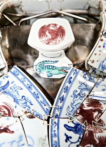
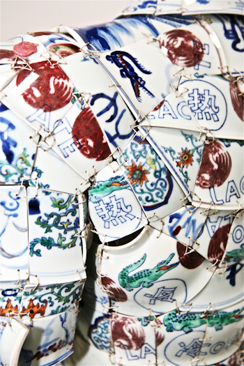
Amidst the countless details on the porcelain polo, the most centralis the point where the pheonix meets the crocodile above the collar. Li Xiaofeng points to this as a point where the emblems of East and West meet. The Lacoste logo represents the West and the pheonix is a traditional symbol of imperial China.
I think that when considering this piece – especially as a commentary on the Lacoste logo – it helps to remember its predecessor: last year’s super-limited edition Campana Brother’s polo, of which there are 24 in the world. As comentaries on branding and logos, how do these compare?
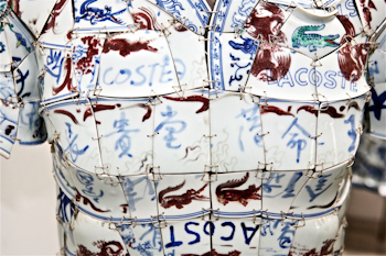
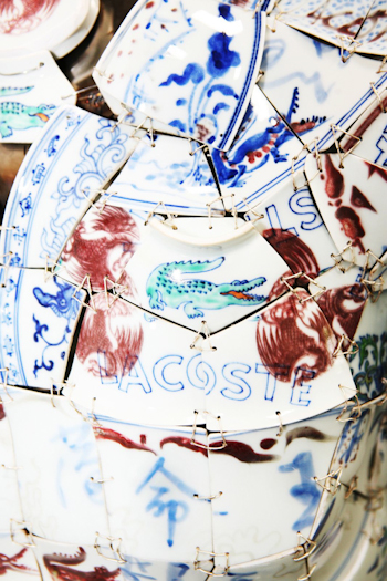
There are Chinese-style crocodiles throughout the piece as well. These red and blue beasts are Li’s own creation and they serve as a contrast to the Lacoste logos seen throughout the piece. Li painted most of the surfaces of the porcelain polo while some of the shards used are from existing vases.
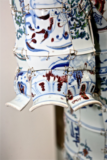
The sleeves use the top parts of the broken vases, achieving an interesting effect.
The red pheonixes mix freely with Lacoste logos as well as the blue and red more free style alligators.
The Chinese characters for cold (冷) and hot (çƒ) appear all over the back of the polo. This was inspired by a moment of rapid temperature change from hot to cold experienced by Li Xiaofeng while he was showering in Jingdezhen, China’s porcelain capital and the place he goes to gather many of his pot shards. This moment caused him to reflect on the relationship between clothing and perceptions of temperature. For his part, he finds the Lacoste polo is often not warm enough for wearing in air-conditioned offices.
Photos: Miko He
